CONTEXT & BACKGROUND
Helping advance the goal of the USGS in collaboration with Our Coast Our Future
Our Coast, Our Future (OCOF)’s flood mapper is a user-friendly web-based tool providing data sourced by the Coastal Storm Modelling System (CoSMos) regarding infrastructure and ecosystem vulnerabilities due to sea level rise and storm hazards.
CoSMoS is a dynamic modelling approach that has been developed by the United States Geological Survey (USGS) that powers data visualization and detailed predictions of coastal flooding in California.
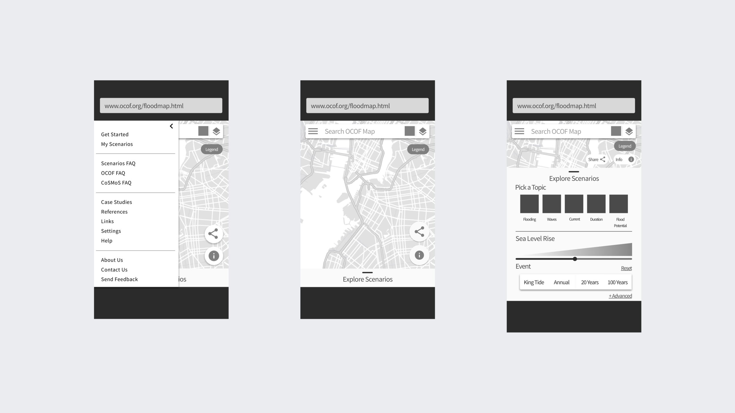
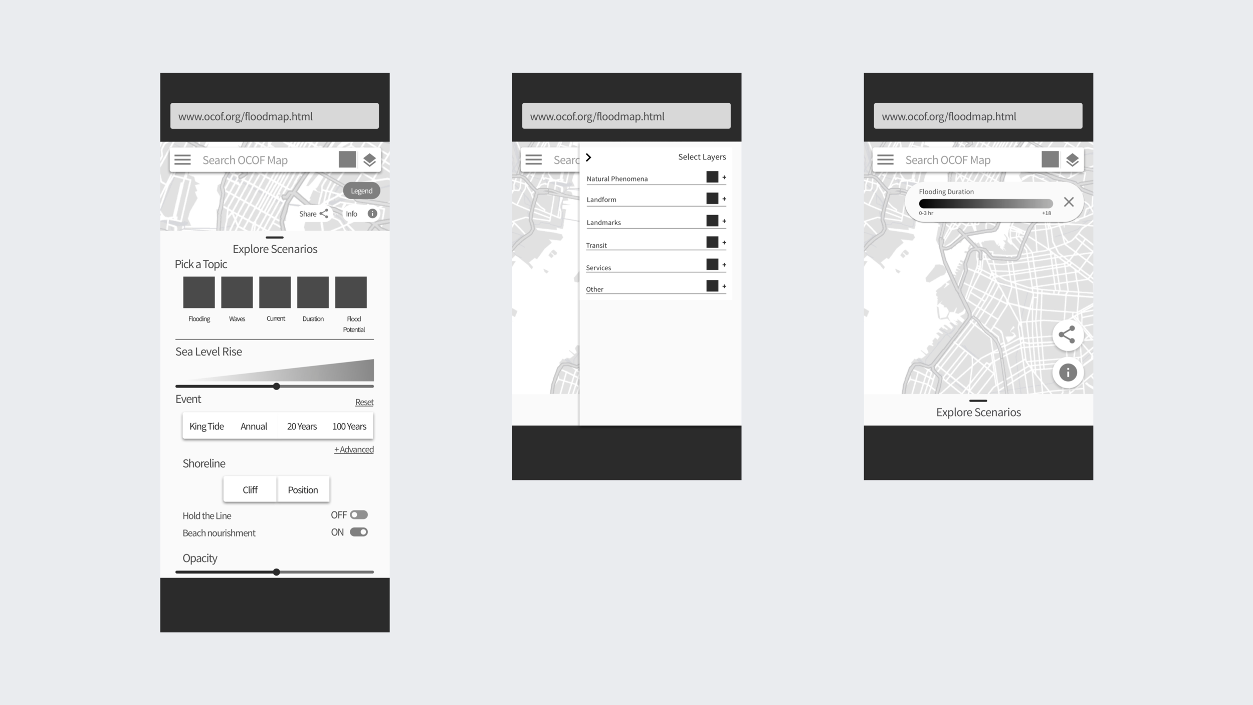
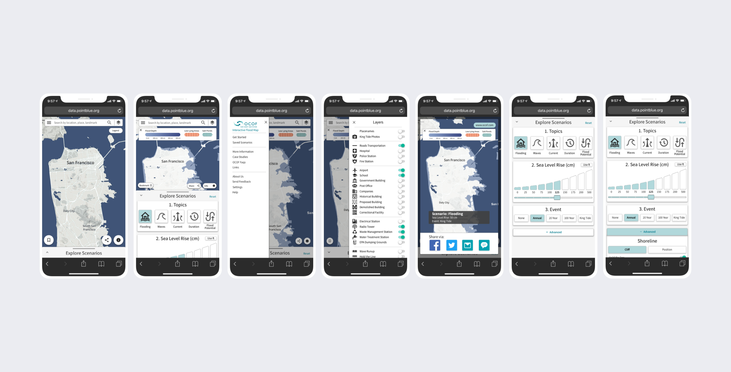
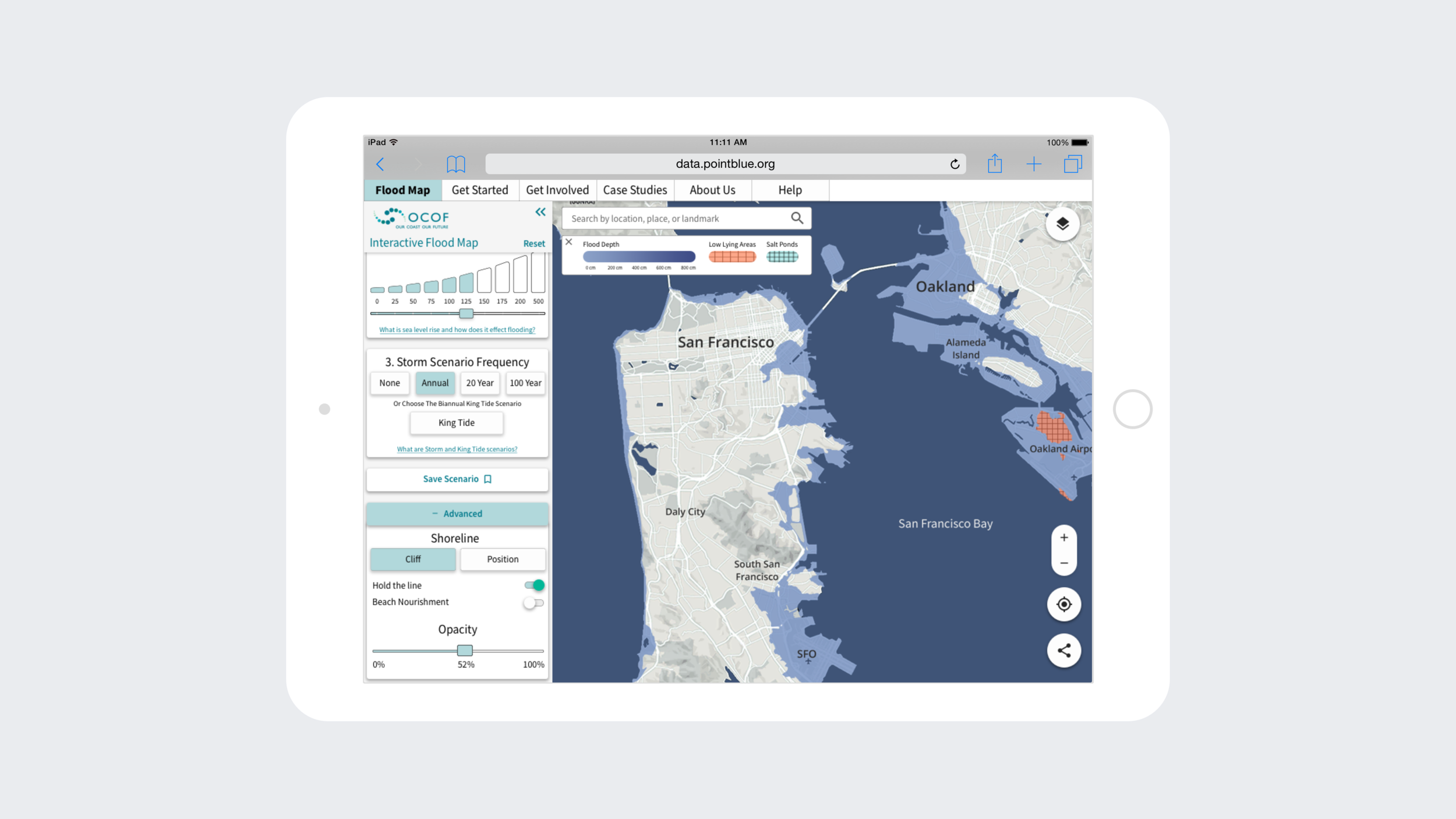
Final mobile deliverables of revamped solution.
CHALLENGE
Making environmental vulnerabilities easy to understand
The challenge was to improve the user experience of OCOF’s existing flood mapper tool with a responsive web solution.
The goal was to help communities and individuals better navigate and utilize the flood mapper tool and the wealth of information provided by CoSMoS.
PROCESS
Prioritizing pain points to better structure information architecture
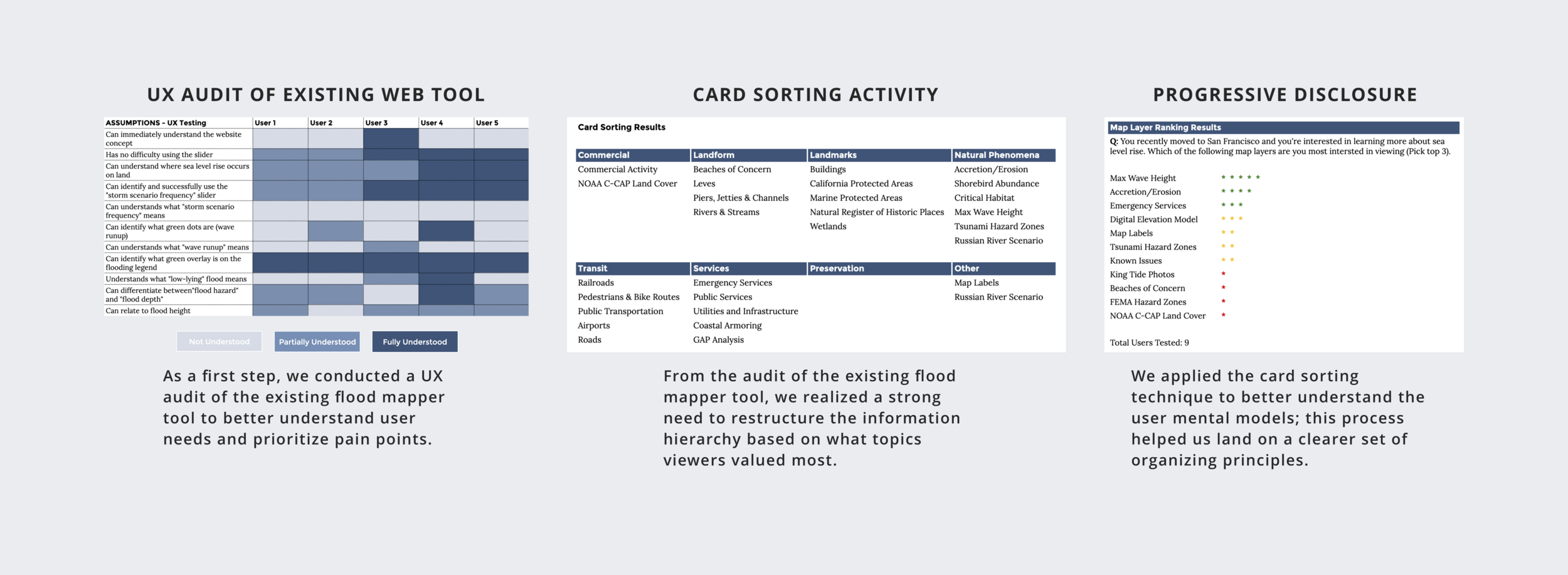
I conducted extensive research of the existing web based app through user interviews to empathize and understand user pain points. The information provided on the tool was overwhelming and confusing to the users. This demonstrated a need for the information to be better understood and re-organized.
LOW FIDELITY WIREFRAMES
Validating design ideas with low-fidelity wireframes
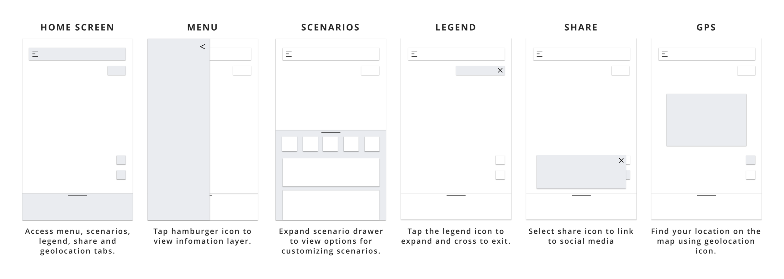
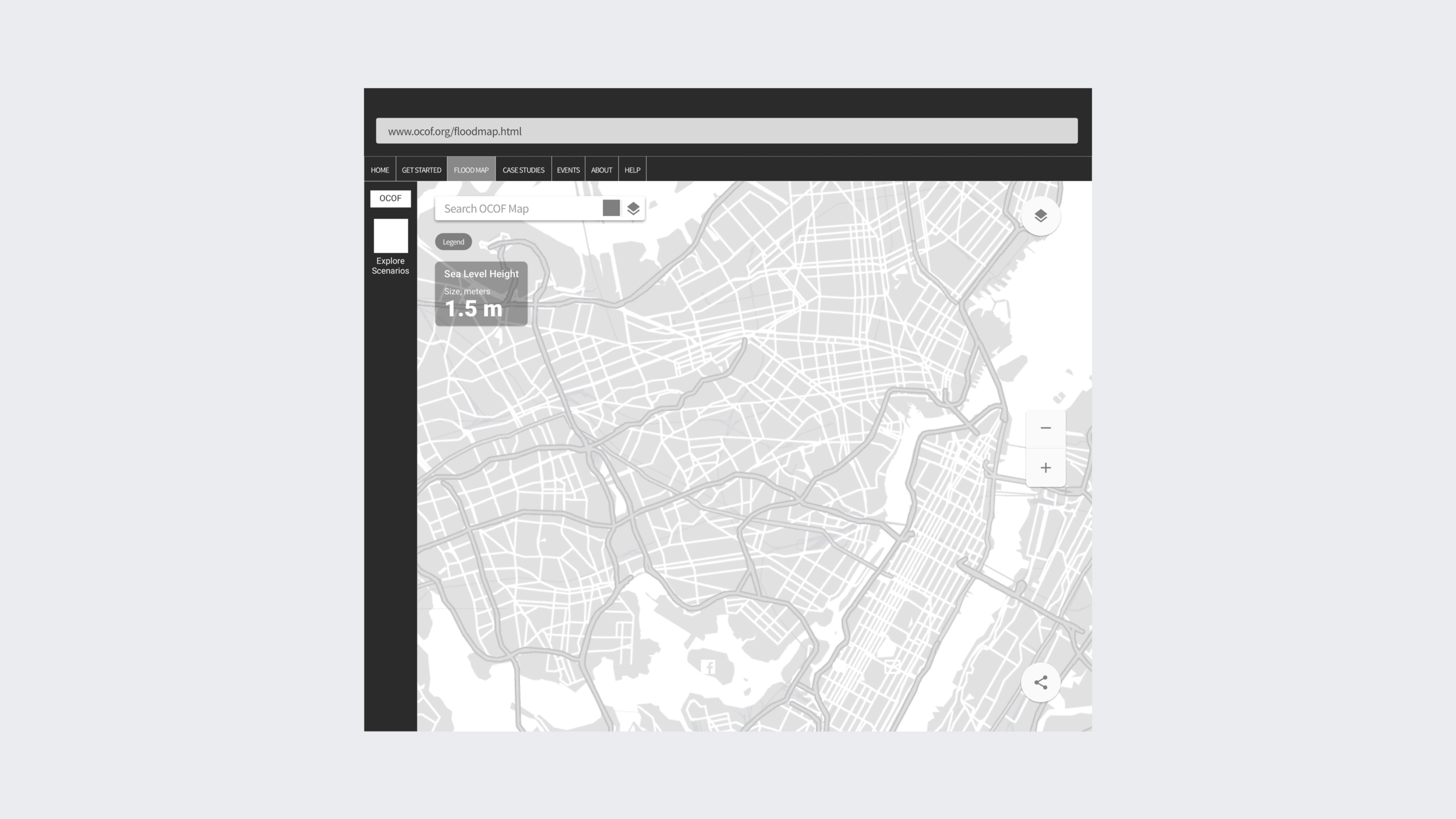
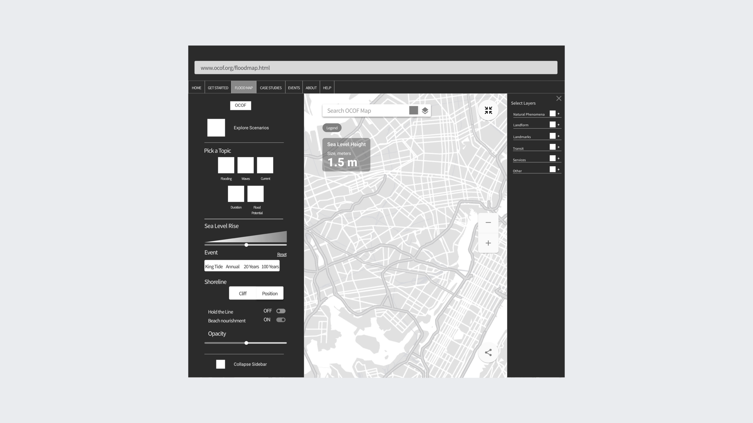
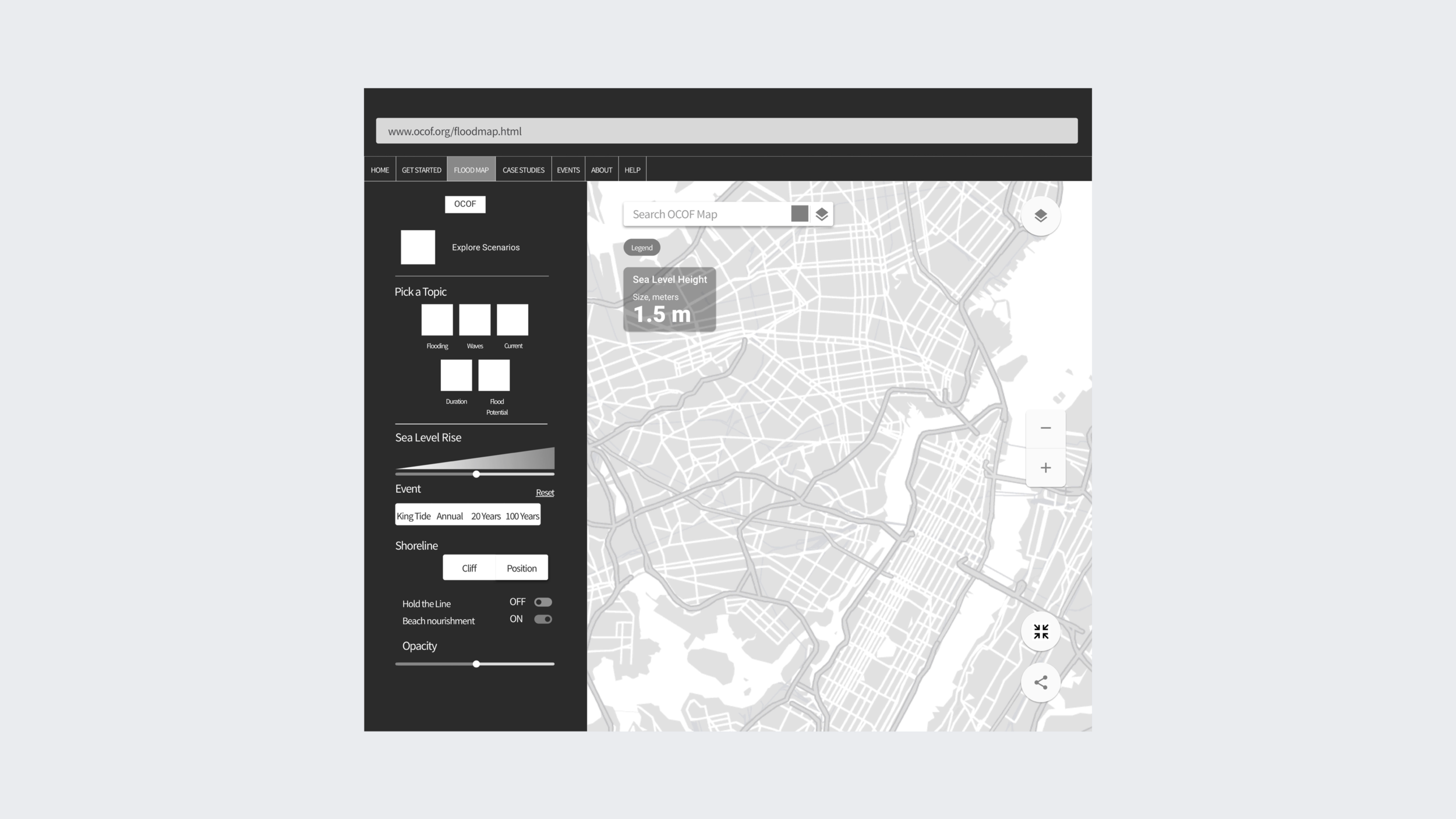
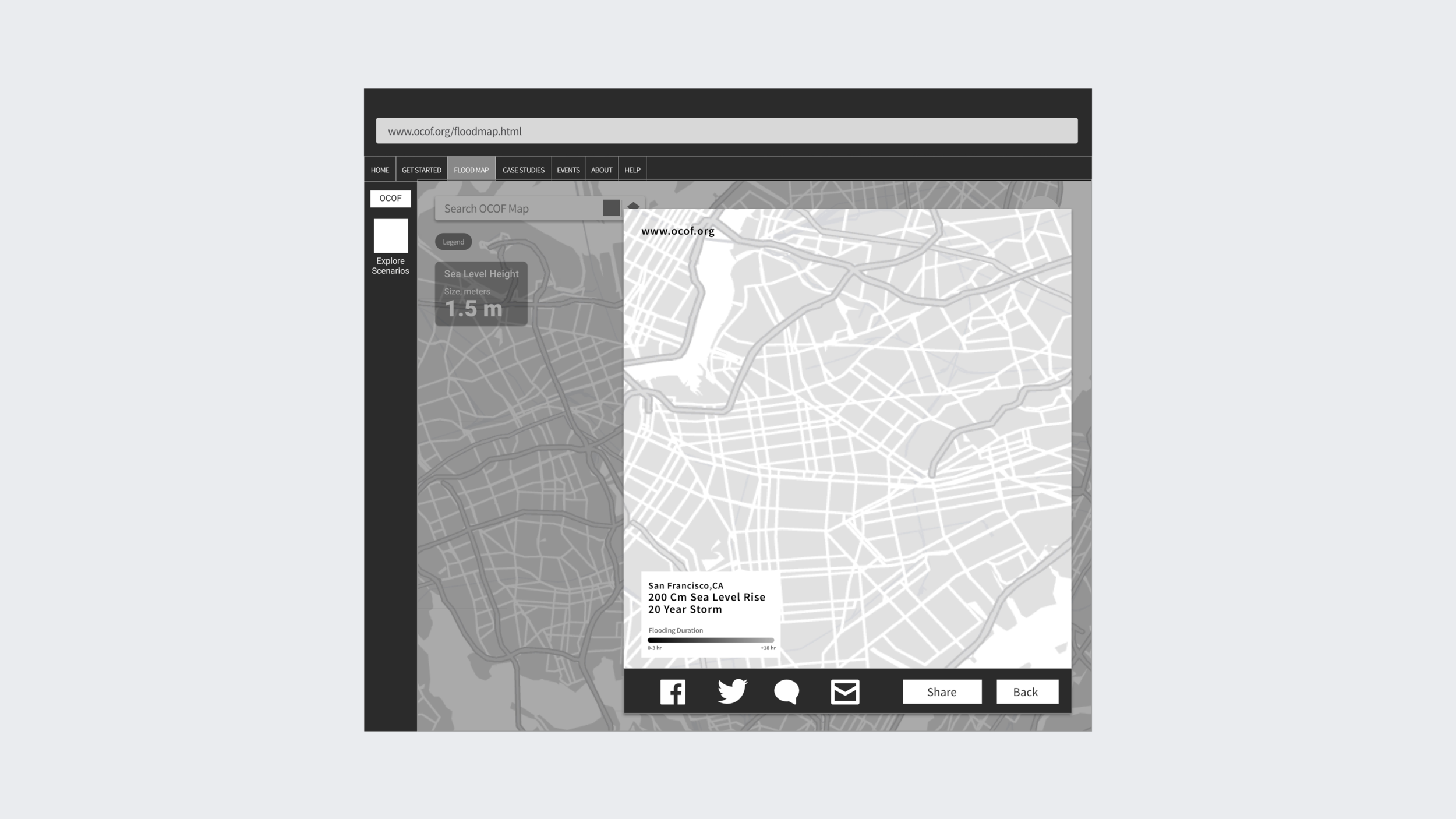
Based on our research findings, I facilitated the rapid development and iteration of low-fidelity wireframes. The goal was to quickly develop high-level design concepts which could be easily translated into tangible and testable artifacts. We started with developing simple wireframes for the platform with the most constraints — mobile.

INFORMATION LAYERS
Rethinking information layers to better align with design patterns
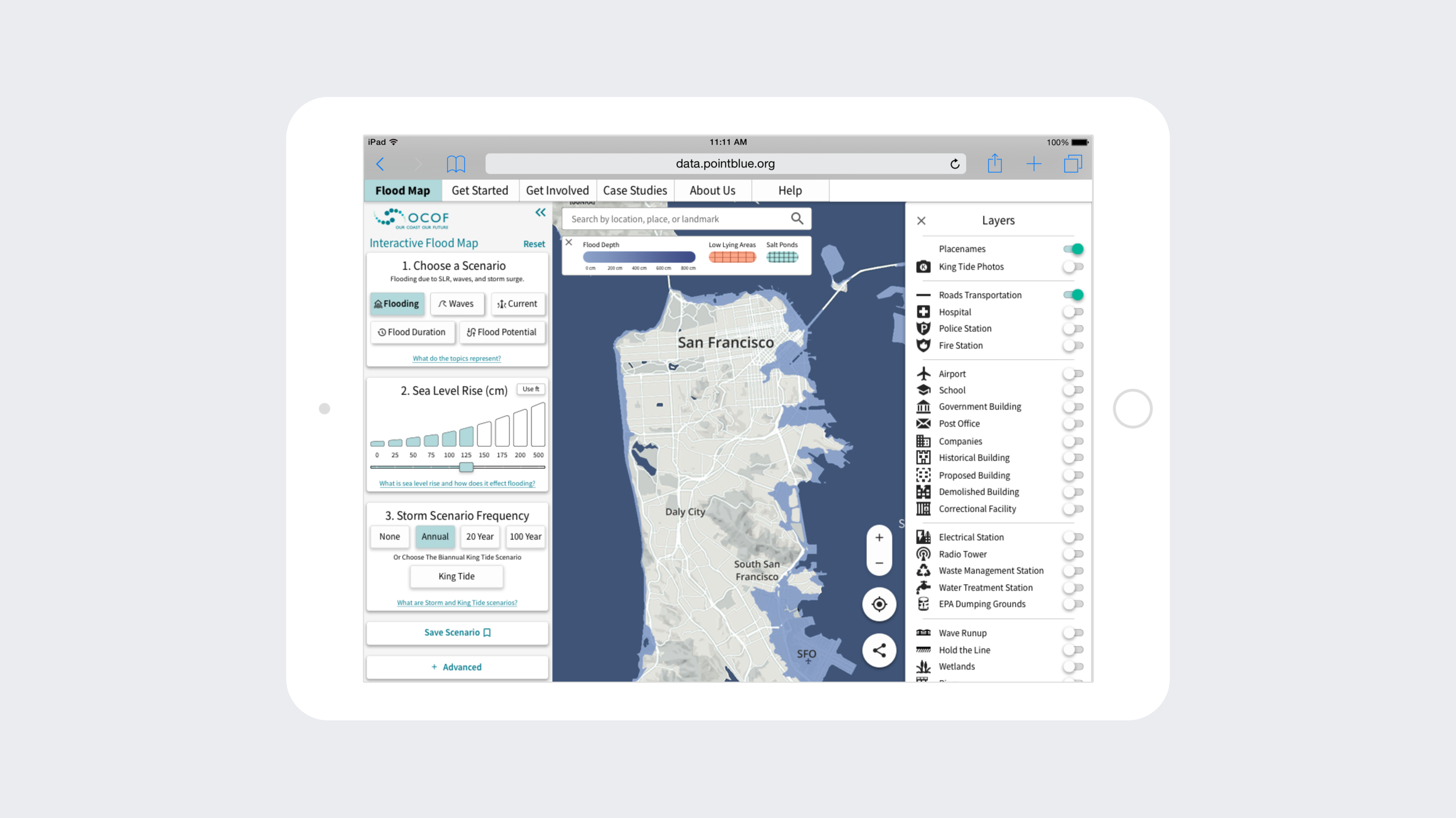
After researching through different apps using side drawers and researching design patterns, we devised the layer structure below.Following the structure, we gradually created low fidelity symbols and cards and expanded to additional pages.
CONTINUED ITERATIONS
Prototyping, testing and iterating to help conclude results and define next steps
We explored variations of progressive disclosure and information organization through a series of iterations and additional usability tests. With these learnings, we refined our designs and conducted a final round of in-depth user testing with a narrower set of prototypes. This process helped validate our hypotheses before developing high-fidelity mockups as the final deliverable.
GRID AND DESIGN SYSTEM
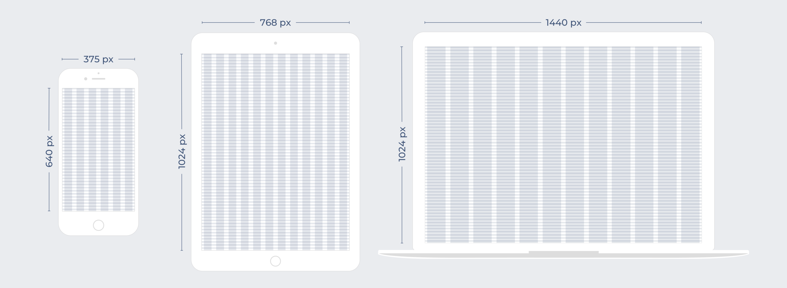
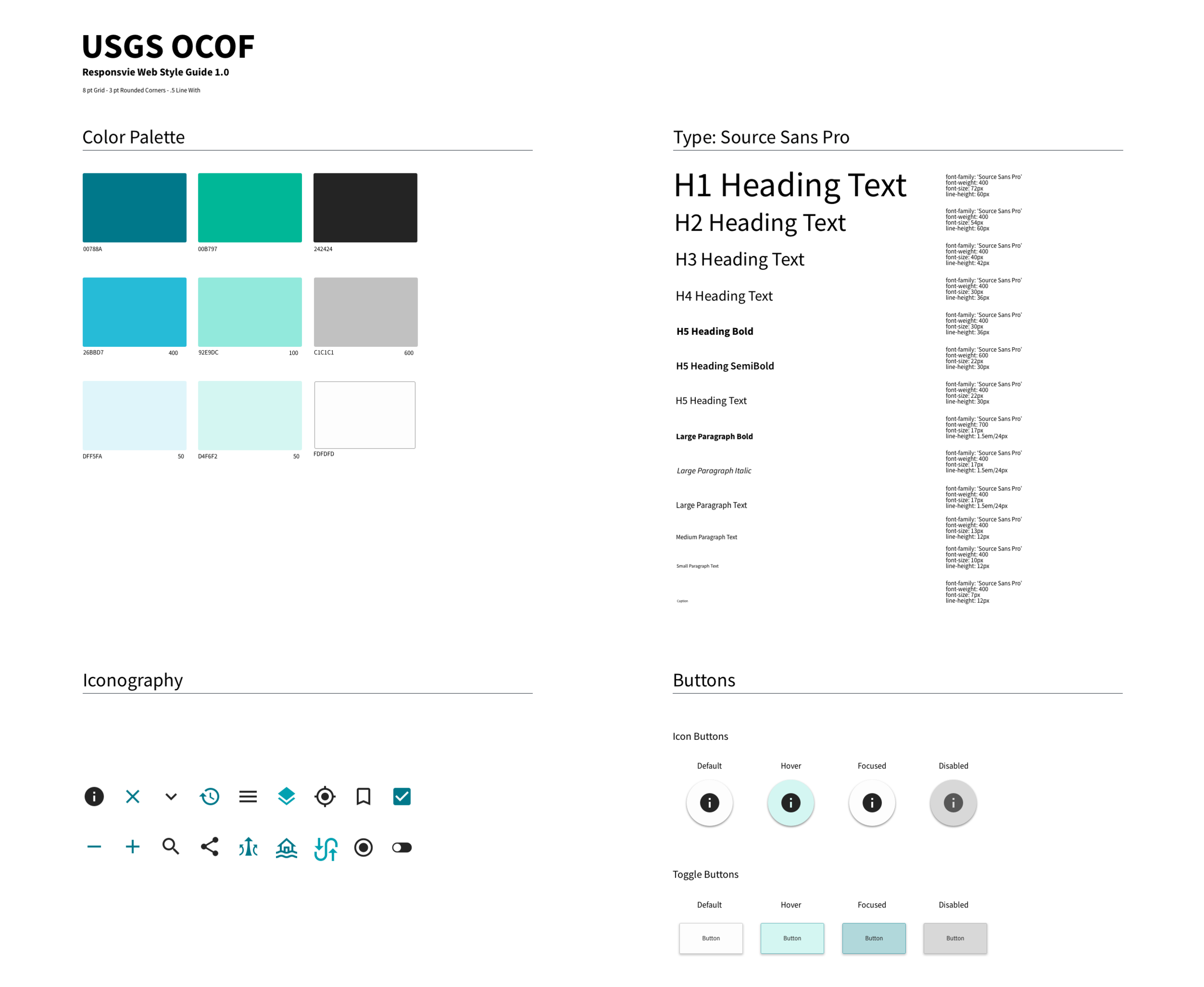
With the existing OCOF brand colours, we created a design system and guideline using an 8-point grid system that would provide a solution for responsive web. Our design team was also mindful of accessibility guidelines in developing this design system. We selected a high colour contrast ratio for the desired aspect of display, taking into consideration the Web Content Accessibility Guidelines (WCAG).OUTCOME
Learning for future improvements
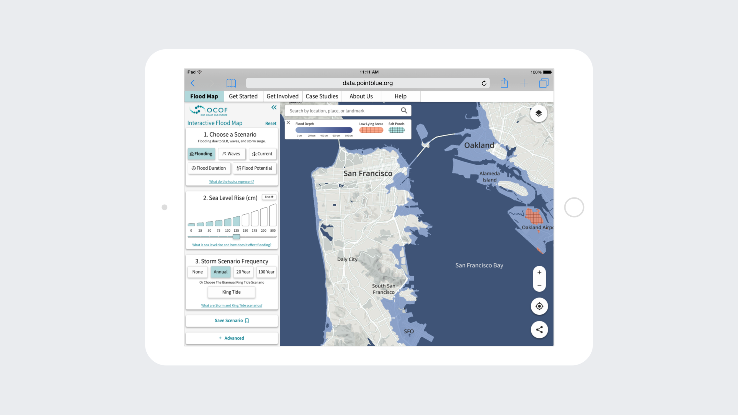
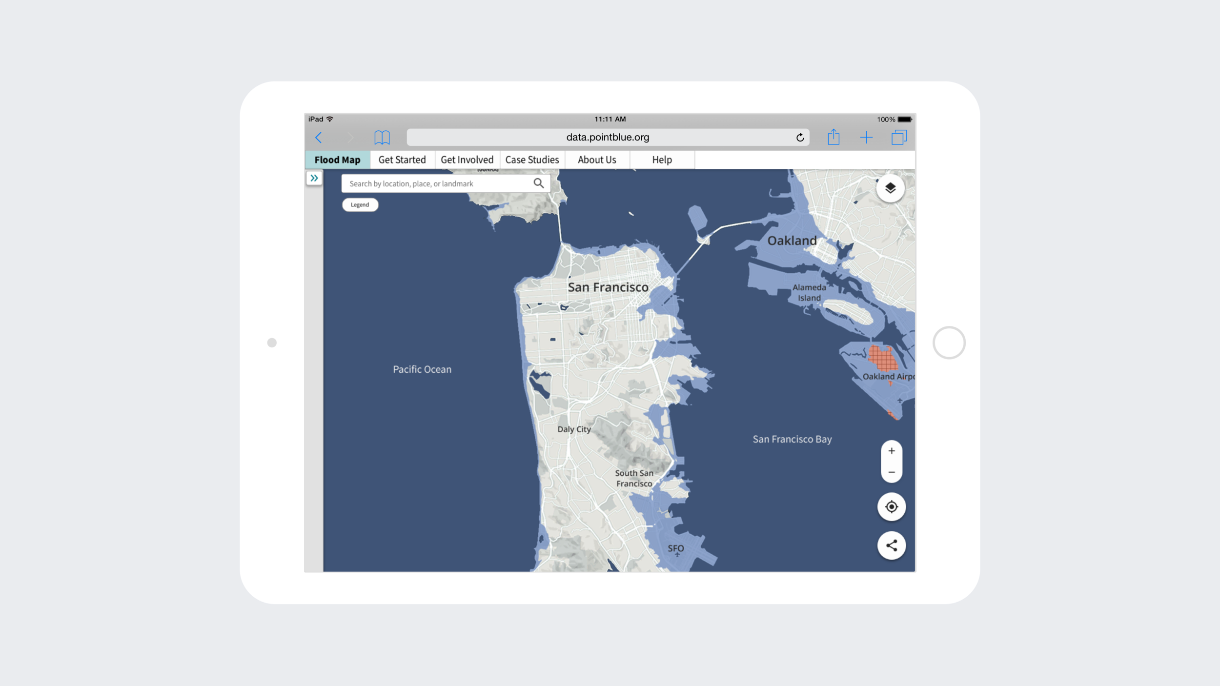
As a final step, we consulted with third-party map providers to source a custom mapping solution that would deliver an enhanced data visualization experience for USGS. The final deliverables included high-fidelity designs across all platforms (i.e., mobile, tablet, desktop).


